Thotha
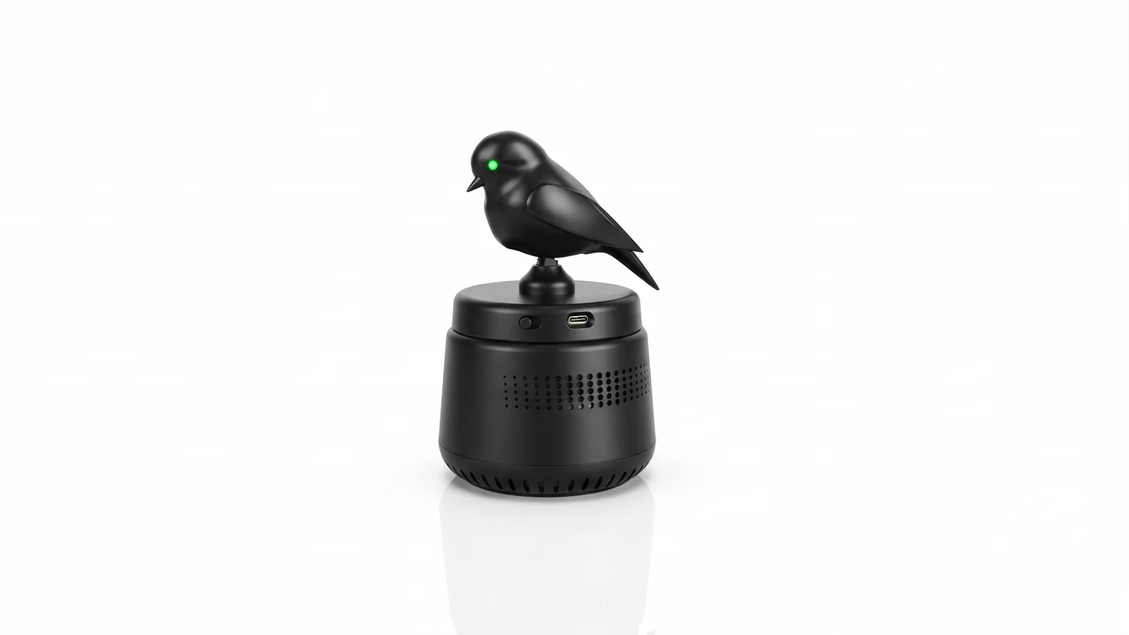
An air purifier. The bird shows you if the air is clean.
Thotha is a compact car air purifier with integrated air-quality monitoring.
But the product does not end with a number.
Instead of asking the user to interpret an AQI value on a screen, Thotha turns air quality into something immediate:
The product becomes the indicator.
THE CONSTRAINT
Air quality data is everywhere. Nobody looks at it.
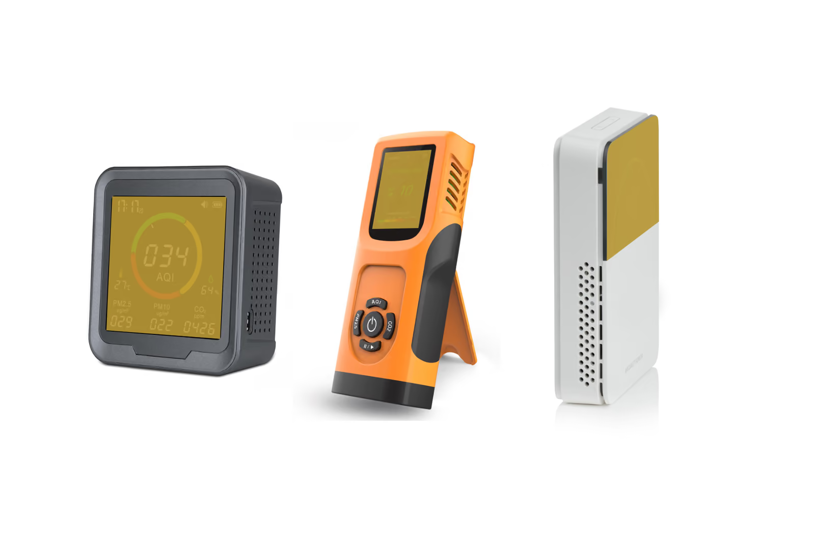
Yet the information about it is everywhere - numbers, graphs, colours, notifications and AQI readings.
The problem is not measuring the air.
The problem is making the measurement understandable.
Every competing purifier can tell you an AQI value. But a number still asks the user to stop, look, interpret and decide what it means.
- 01Stop
- 02Look
- 03Interpret
- 04Decide
For a product that lives inside a car, that feels like the wrong interaction.
The question
How do you communicate air quality without asking the user to look for the answer?
The information should always be visible.
- Notburied in an app.
- Nothidden behind a number.
- Notsomething the driver has to decode while driving.
The basic question is much simpler: Is the air good or not?
Nothing more is required for the primary interaction.
What does this number tell you?
The constraint was therefore not technical - it was communicative.
The electronics to measure particulate matter were already part of the product direction. The harder design challenge was turning that invisible measurement into a signal that could be understood at a glance.
THE FORK
"Show, don't tell" - give a character to the product.
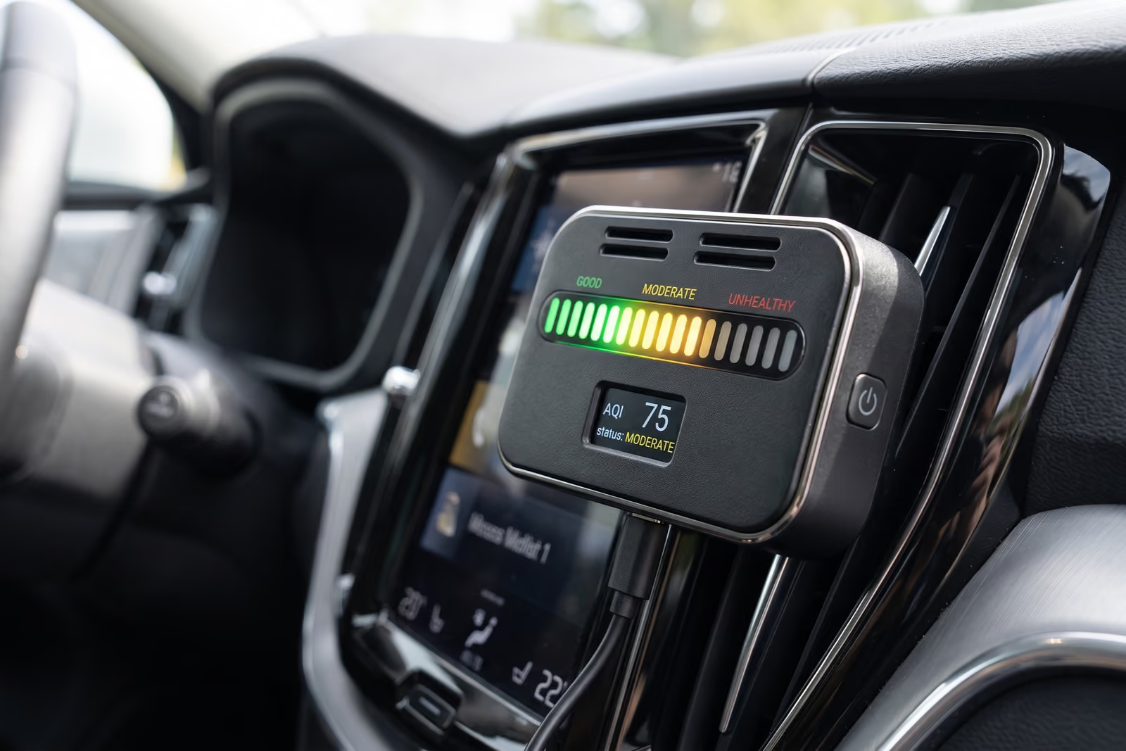
Use light.
A light could move from red to green and back again as the AQI changed.
- It would be immediate.
- The user would not need to search for an answer.
- But moving lights are generic.
- Can everyone understand the lights?
What happens when the person looking at it is colour-impaired?
If the interaction depends on colour, part of the audience is already being asked to interpret something differently.
So the question moved one step deeper: not every obvious solution is the answer.
What if the product itself could react to the air?
That became the turning point.
Instead of making the user interpret a signal, the object would embody the signal.
The concept borrows from one of the oldest environmental indicators: in coal mines, canaries were used as a warning for dangerous air. This bird lives in your car and communicates the same basic signal - without dying, without a screen, without an instruction manual.

The communication becomes physical and direct.
That's it.
- No graph.
- No number.
- No analysis required from the user.
The product senses the condition and reacts to it.
THE MAKING
The systems
Form follows functionForm works alongside the function to give the experience.
From character to form
Once the bird became the interface, it could no longer be treated as decoration added to an existing purifier.
The interaction had to become part of the product architecture. The result had to remain compact enough for a car while still making the interaction legible.
The character became part of the product language.
One object. Many processes working together.
The simplicity of the interaction hides much more involved internal processes.
Thotha brings multiple processes into one compact product:
- 01SENSINGMeasures the condition of the air.
- 02PURIFICATIONMoves air through the filtration system.
- 03INTERACTIONTranslates the air-quality state into the bird's physical behaviour.
- 04CONTROLCoordinates sensing, purification and the physical response.
- 05CONNECTIVITYProvides the foundation for the connected product experience.
The form started with the air
The product had to do two things at once:
sense the air
move it through the purifier.
That made airflow part of the industrial-design problem from the beginning.
The fan, filter, sensor and surrounding structure had to fit inside a compact form appropriate for a car interior.
The outside needed to remain simple.
Inside, the architecture had to do considerably more.
Early development explored the form of the object, the placement of the bird, the airflow architecture and the relationship between the visible character and the hidden technical systems.
Tilt mechanism
- 01Body shellMoves with the motor
- 02Servo motorMounted inside the body
- 03Fixing screws × 2Motor to body shell
- 04ShaftFulcrum at the motor axis
A motor normally sits in the base and drives the object through a shaft. Space constraints put the motor inside the bird, so the body turns with the motor.
The bird mechanism became one of the critical pieces of the architecture.
Its movement needed to remain simple enough to communicate a clear state, while the mechanism itself had to coexist with the filter, fan, sensor, electronics and replaceability requirements.
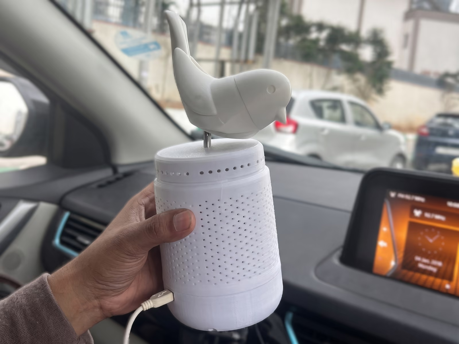
The first prototype was a plug-in model.
It established the basic system and allowed the interaction and hardware architecture to be tested physically.
But once the product moved away from a simple plug-in configuration, the architecture became more complex.
A battery was introduced. More components and wiring were required.
The bird mechanism asked for wiring to run from the bottom of the product towards the top.
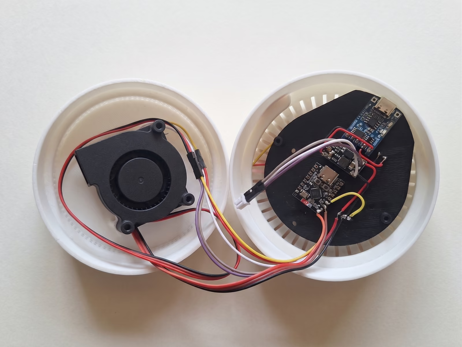
That created a direct conflict with one of the most important physical requirements:
The wiring route was beginning to obstruct the part of the product that needed to remain accessible for filter replacement.
the HEPA filter needed to remain replaceable.
This was not something that could be solved by hiding the wires more carefully.
The architecture itself had to change.
Moving the electronics changed everything
The solution was to shift the electronics to the top of the product.
That created clear space in the lower section for the HEPA filter.
electronics and bird mechanism above
filtration below
The important part was that none of this complexity needed to be exposed to the user.
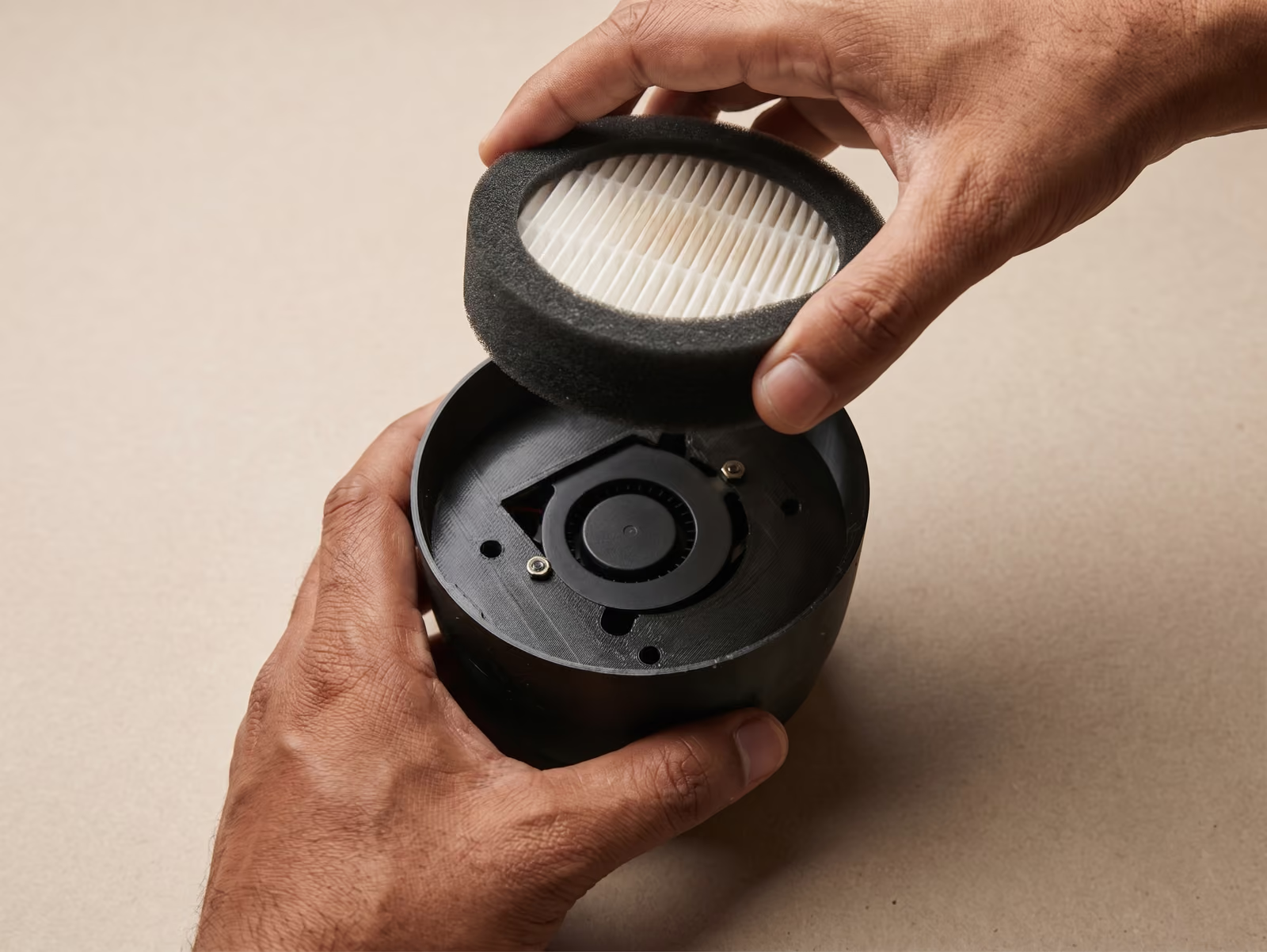
The user could still access and replace the HEPA filter without encountering the electronics or internal wiring.
The product became more serviceable without making the system more visible.
A new PCB for a new architecture
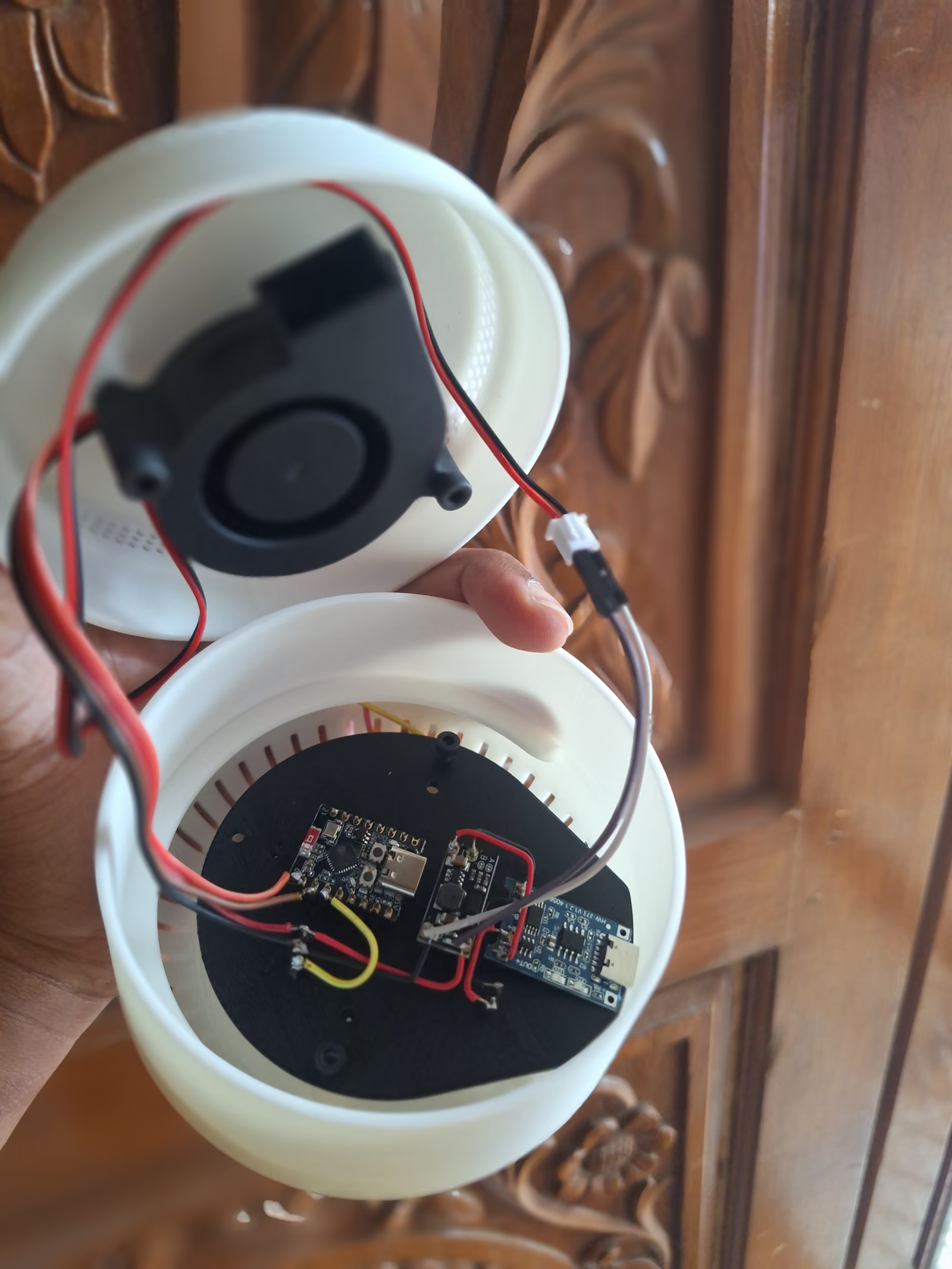
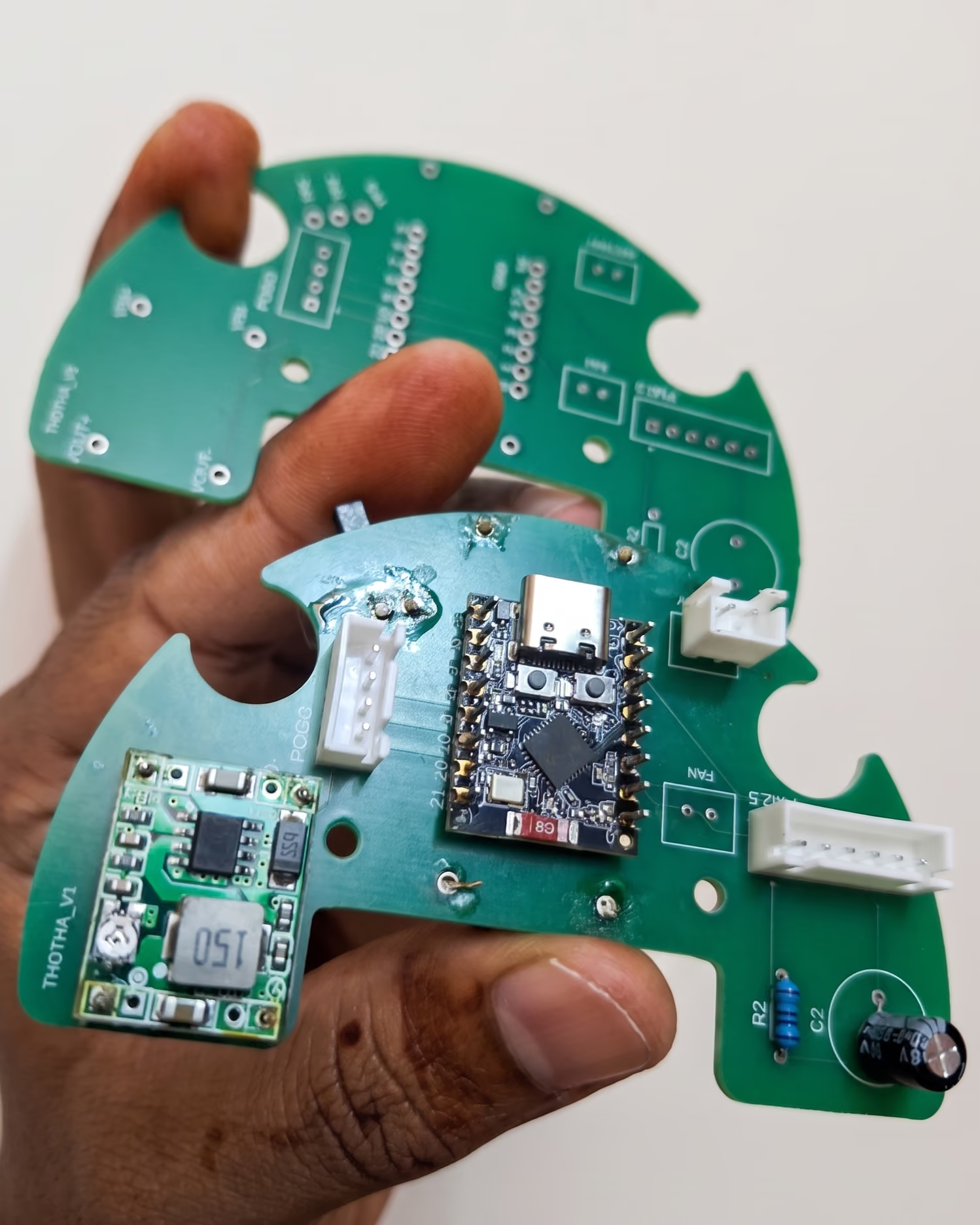
Moving the electronics changed the electrical architecture as well.
A new PCB was required to resolve the electrical issues created by the new layout and to improve wiring routing through the product.
- 01Mechanical architecture
- 02Electrical architecture
- 03Interaction mechanism
The mechanical architecture, electrical architecture and interaction mechanism therefore had to evolve together.
The goal was not simply to make everything fit.
The goal was to make the whole system work as one object.
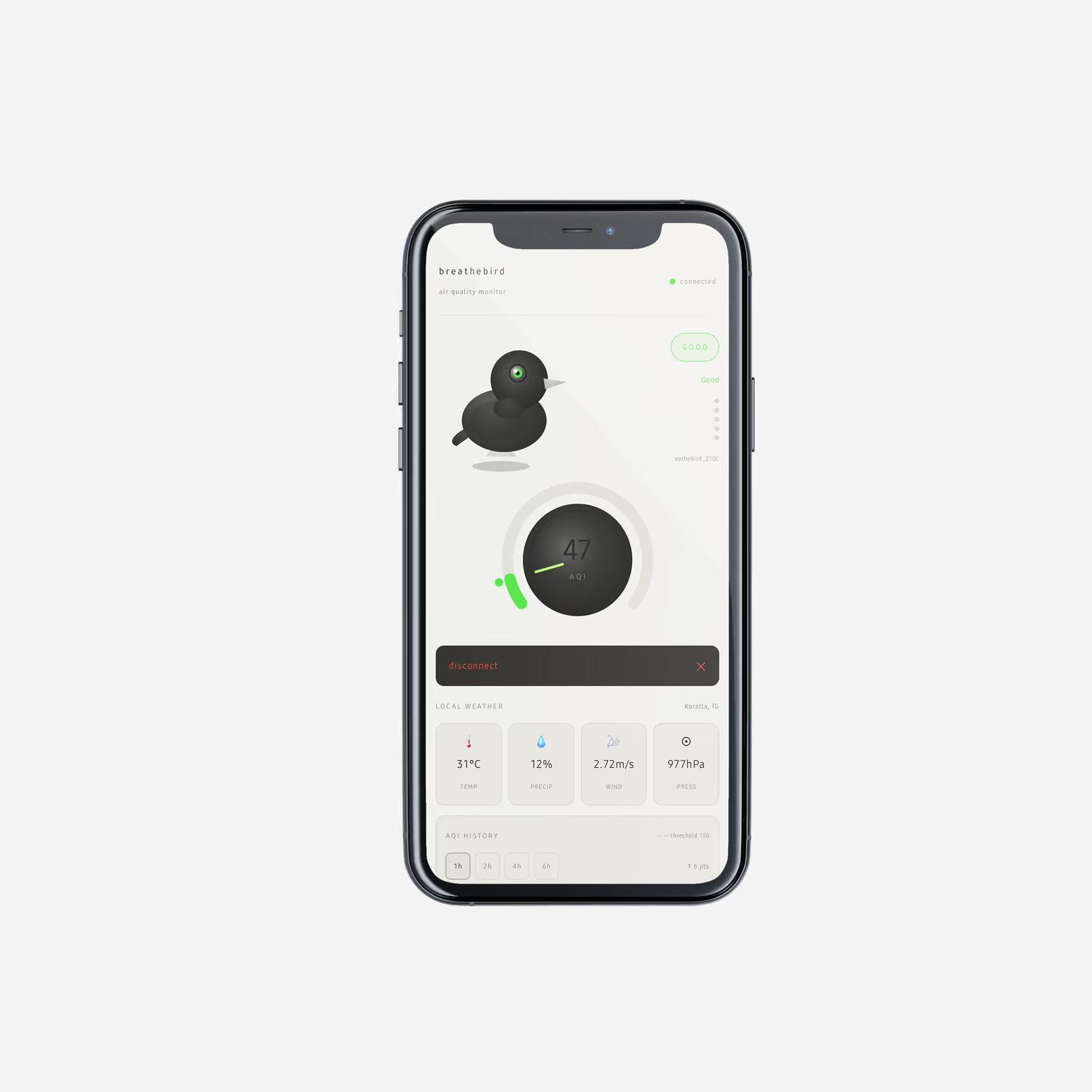
The prototype had to behave as the product intended, not simply look like it.
Prototype evolution
From one working model to five beta units
The development moved through repeated physical iterations rather than treating the first successful build as the finished product.
- 01
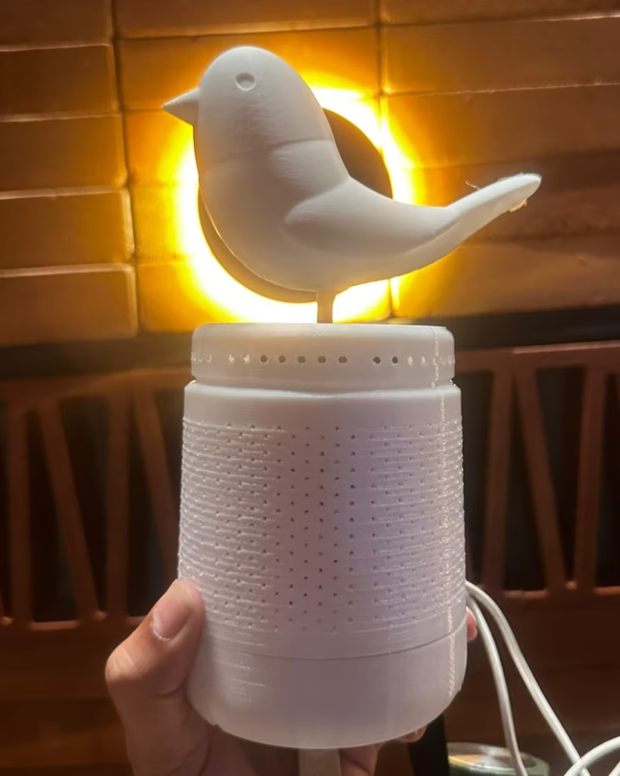
The first prototype established the core system.
- 02
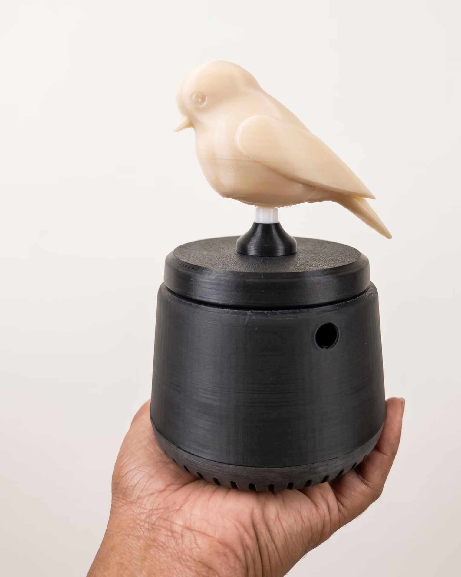
Further iterations addressed the battery, wiring, bird mechanism, internal architecture, filter access and electronics.
- 03
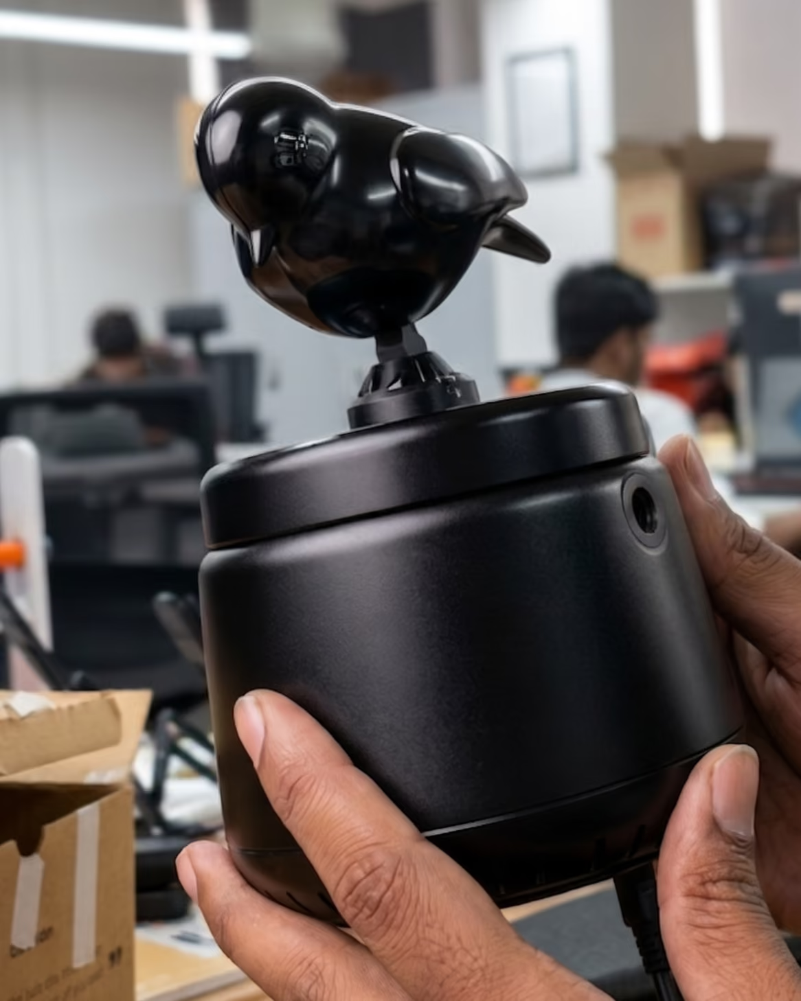
The final beta phase produced five units.
Five beta units were built to move the concept beyond a single working prototype.
- product size
- electronics
- interaction
- UX features
- connected experience
CMF
Familiar enough to belong. Different enough to notice.
Once the functioning architecture was fixed, the focus moved to aesthetics.
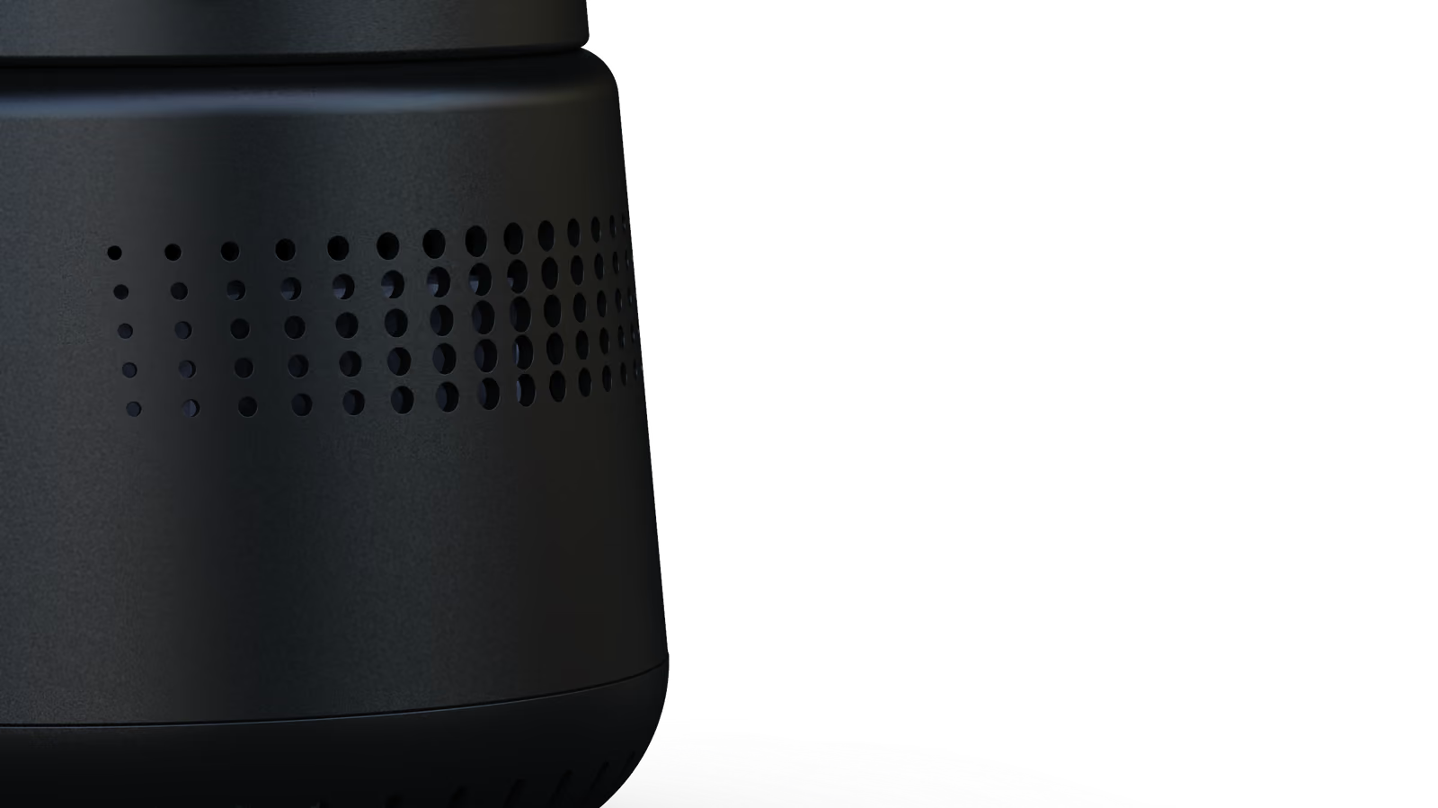
The visual direction keeps the product restrained rather than turning the character into a toy.
- executive minimalism
- automotive product references
- restrained matte surfaces
- a tactile dark body
- a contrasting metal element
- controlled white, green and blue light
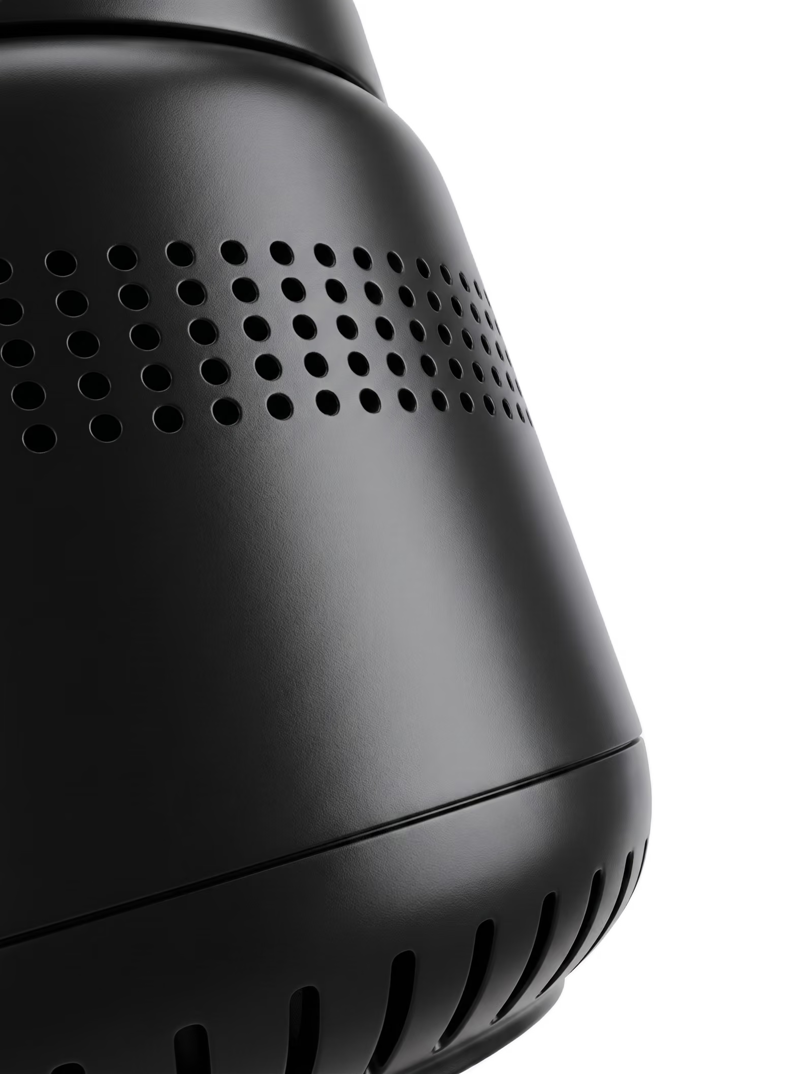
The goal is for the product to feel appropriate inside a car first - and characterful second.
The bird gives the object personality without making the object feel like a toy.
From prototype to beta production
Five units, built as real products
THE OUTCOME
What happens when the product becomes ours?
The final product brings the original decision back into focus.
Air quality is invisible.
The user should not have to go looking for it.
The bird provides the answer through its physical state.
The interaction is intentionally simple because the product is doing the interpretation for you.
It all started with the question:
What if the product could react instead?
That decision shaped everything that followed:
- bird
- shapedmechanism
- shapedarchitecture
- shapedelectronics
- shapedform
And the final form had to hide all of that complexity behind a simple physical interaction.
One object. One clear message.
The intelligence is not in adding more information.
It is in deciding what information the user actually needs.
THOTHA
Let the product show you.
The strongest idea in Thotha is not the bird itself.
It is the decision behind the bird:
When technology measures something invisible, the interface does not have to become another screen.
Thotha makes the product itself responsible for communicating what it knows.
- 01Sense.
- 02Interpret.
- 03Respond.